Does your home have wood rot that needs repair?
A deck in need of a powerwash or facelift?
Call us TODAY for an ESTIMATE before time gets away from you.
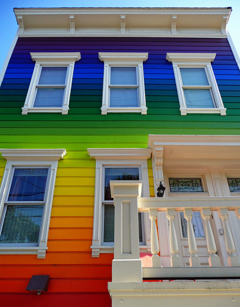
Visit our Gallery of Homes painted by Franklin Painting
This is only a very small sampling of our work –
specific area references provided on request.
by Frank Campanelli – frank.campanelli@gmail.com
Spring is just around the corner and we will have a full slate of work so why not get in early and schedule the important maintenance you need now.
 860-678-7701 Main Number
860-651-7701 Simsbury Local
860-646-7774 Manchester Local
877-646-7774 Toll Free
www.franklinpainting.com
We use only the best paints, no bargain brands at Franklin Painting. Sherwin-Williams is always a great choice and they have some advice on choosing colors for exterior painting that we wanted to share with you.
Neutrals
Raw materials continue to influence color trends, especially the more subtle hues. Picture a field of grain, pile of pebbles, weathered wood and earthen clay. Gold tones embody the sun and soft metallics – and warm up this understated yet refined palette. Textural elements, such as linen, unfired porcelain and mixed woods, provide subtle tonal variations.
Reds
Red is the color of love, fire and the earth’s molten core, and it stirs raw emotions ranging from the deepest passion to the softest femininity. This saturated palette includes hues of brilliant flowers and glowing embers. It isn’t a single red, but a deep gradation of fuchsias, red-oranges, violets and delicate pinks.
Blues
This soothing palette celebrates a pair of functional and treasured blues: denim and water. It explores the darkest indigo to faded-jeans hues, some with violet undertones, as well as the calm, shimmery shades that reflect rivers, lakes and seas.
Greens
Casting aside the more innocent yellow-tinged greens of the past, this eclectic palette focuses on greens that are lush, moody and complex. It showcases the depths of the sea and forest; leafy motifs; rustic natural textures; and organic elements such as algae, moss and seaweed.
ColorMix™ 2012
The Sherwin-Williams colormix™ 2012 forecast proves a color palette doesn’t need to stray far from its roots to make a big design impact.
“Colors that are analogous, or adjacent on the color wheel, are a dominant trend,” said Jackie Jordan, director of color marketing for Sherwin-Williams. “We discover a fresh array of combinations within color families – be it fiery reds, watery blues, grassy greens or organic neutrals.”
Forget the expected tone-on-tone pairings. Sherwin-Williams color experts drew inspiration from fashion-forward color-washing and ombré dyeing techniques to experiment with color values and hues within color families to create four vibrant palettes. They also embraced the sustainable landscape – which has become an enduring influence on all aspects of décor and design.
“Just hone in on a color you love and the ideal, natural complement will be right nearby,” Jordan said.
The 40 hues highlighted in colormix 2012 stay close to home with earth-inspired, color family groupings: Reds, Blues, Greens and Neutrals.

Frank Campanelli, the esteemed founder of Franklin Painting LLC, has been leading the company since 1986. He takes immense pride in the stellar reputation his dedicated team has built by consistently delivering top-notch service to each customer.