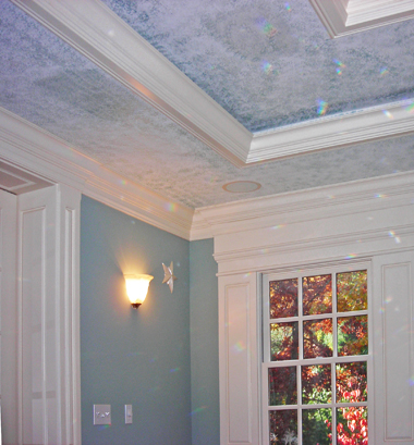
 The next time you’re thinking about painting something in your home – a room, a wall, the whole interior, all of the exterior – consider the effect your choice of color might have on the people in your life. It has long been understood that humans are generally influenced in predictable ways by the colors they observe, so let’s look at how color can influence mood.
One thing we all know is that bright, glaring colors attract our attention. This is one of the reasons you don’t find too many consumer products packaged in gray and tan. Yet through the range of the dominant colors of our world we find remarkable differences in the moods they set, a principle well-known by artists, merchandisers, psychologists and interior designers.
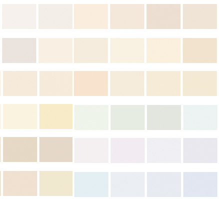
Here are some popular colors and what the “experts” believe they signify to the “average” person.
Green
Related to money, nature, balance. Green shades are thought to create a calming, settling effect and a powerful money-mood. In excess, green may bring about excess tranquility leading to laziness. It’s an ideal color for bedrooms.
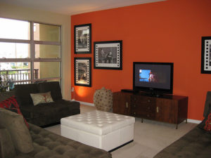
Orange
Related to reassurance, warmth, social activity. Orange is often seen in places where a lot of movement is going on such as fitness clubs. It’s a motivational color that brings confidence. Living rooms and dining rooms look good in Orange.
Red
Related to passion, intimacy, adventure. Few colors attract the senses like red does. Look at all the consumer products and logos that feature this color (Coke, KFC, Target). Red can wind you up and get you moving, but remember – it’s also the color of danger and warning. Great when used with discretion in bedrooms and dining rooms.
Lilac
Related to mystery, spirituality, creativity. For some reason, lilac puts us in a deeper and more contemplative mood. The color is widely used among spiritualists to evoke useful states, but at the same time some view this shade as bordering on depressive. It’s a good color for bathrooms and bedrooms.
Blue
Related to intelligence, protection, calm. In studies, student exposure to this color resulted in better scores on exams. Blue is a powerful color that seems to wake us up and point us in a good direction. Blue works well in bedrooms and offices.
Pink
Related to love, sweet, feminine. Pink is often used where fun and frivolity are happening. It has been shown to reduce aggression and anger – a jail in Arizona dresses its inmates in pink to settle them. Women tend to be influenced more by pink than men, but probably due more to social conditioning than the power of the color. Pink is very popular for girls’ bedrooms.
Black and gray
Related to protection, strength, formality. Black is a no-nonsense color that’s perfect when you want to make a statement without making one. Both black and gray are strong colors, masculine to an extent, and always are appropriate in formal settings. Too much black can send “dark” signals. Black is a good choice when used sparingly for any room.
You can see how people generally react to colors by considering the examples here. Use them as guidelines – but not rules – when undertaking your next painting project.
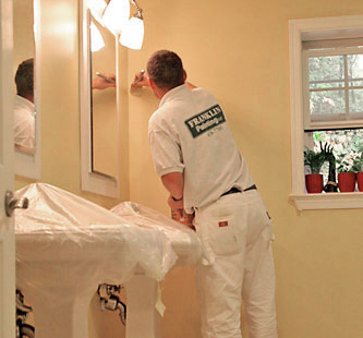
For the best in interior and exterior painting, count on the pros at Franklin Painting of Farmington Connecticut to produce outstanding results every time. Have a question or want an estimate? Call us at (877) 646-7774.

Frank Campanelli, the esteemed founder of Franklin Painting LLC, has been leading the company since 1986. He takes immense pride in the stellar reputation his dedicated team has built by consistently delivering top-notch service to each customer.