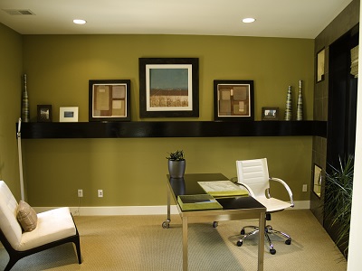
Business owners who want to create workplace environments that promote productivity can find success toward that goal with the use of color psychology. By simply painting walls in certain colors, you can help to elevate both mood and productivity levels of your employees. People naturally respond to the colors in their environment. Color psychology is nothing new; so it’s a proven strategy. Multiple studies have revealed similar outcomes, with regard to emotions and other human responses to specific colors.
Greens
To encourage creativity, innovation, and thinking outside the box, green is an excellent color choice. If deadlines are a concern, various shades of green also help to promote improved focus and efficiency. Employees who put in long hours staring at a computer screen experience less eye fatigue, when surrounded by green. The natural color of leaves can also promote a sense of calm. But be careful to avoid darker tones of green because dark green shades can stir feelings of sadness.
Blues
Blue is an ideal color to choose if a relaxing oasis filled with peace and tranquility is the environment you want to create. Shades of blue, as long as they aren’t too dark, can decrease both heart rate and appetite and create calm, even in the midst of chaos. Blue also shares several qualities with green, including promoting efficiency and focus.
Yellows
When used with restraint, yellow can be used to inspire creativity, innovation, and the development of ideas. Yellow is happy, optimistic, and energetic; and it works best as an accent color. Too much yellow or too bright a shade, however, has been known to evoke feelings of hunger and of anger.
Neutrals
When neutral colors alone are used in a work environment, they don’t tend to have any type of stimulating effect. But shades of white, cream, brown, gray, and black can all liven up or tone down brighter shades.
Orange
For an environment used to communicate to consumers that your service or product is a good value and a problem-solver, choose orange as an accent color. Color psychology shows that people naturally tend to associate orange with good prices and the best solutions to dilemmas.
Colors to Avoid in the Workplace
There’s a reason it is recommended that orange only be used as an accent in association with customers. Orange and purple are both colors that cause men in an office atmosphere to feel sad and depressed. For women, white and beige evoke the same feelings. Indeed, just as some colors are perfect to stimulate productivity and peacefulness in the workplace, others should be avoided for the negatives they are associated with. The following are more shades to avoid:
- Red is a color that should absolutely be avoided in the workplace. Crimson red can stimulate feelings of hostility and anger in employees. Basic red increases heart rates, respiration, and brain wave activity. As a result, employees can become over-stimulated.
- Black and dark gray can sometimes be effectively used as accent colors, but too much of these shades is a bad thing, since they can cause employees to feel sad or depressed.
- Brown walls have colors in nature, which can create warmth, but brown can also have a de-energizing effect on employees, since the color makes a room seem dark.
 Help from a Color Consultant
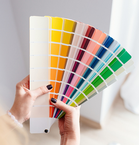 Help from a Color Consultant
It’s always a good idea to take the guesswork out of a painting project with the help of a professional color consultant. Franklin Painting offers professional paint jobs, along with the assistance of an expert color consultant who has an understanding of color psychology. Create a more productive and inspiring work environment by contacting Franklin Painting at 877-646-7774 today for fresh interior painting.

Frank Campanelli, the esteemed founder of Franklin Painting LLC, has been leading the company since 1986. He takes immense pride in the stellar reputation his dedicated team has built by consistently delivering top-notch service to each customer.